Capacity Planning
Dashboard Purpose
The Capacity Planning dashboard provides infrastructure-wide visibility into resource trends over time. Use this dashboard to identify capacity constraints across your SQL Server estate and plan hardware investments. For instance-specific troubleshooting and optimization, see the Instance Overview dashboard.The Capacity Planning dashboard presents historical resource consumption metrics for your SQL Server instances so you can spot trends, judge current load, and predict when additional resources will be needed. This dashboard helps you make informed decisions about hardware upgrades, VM rightsizing, database consolidation, or workload redistribution by providing clear visibility into CPU, storage, I/O, and memory utilization patterns over time.
Dashboard Sections
CPU History
The CPU History section provides comprehensive visibility into CPU capacity and utilization across your SQL Server instances, enabling you to compare differently sized servers on a common scale and identify when additional CPU resources will be needed.
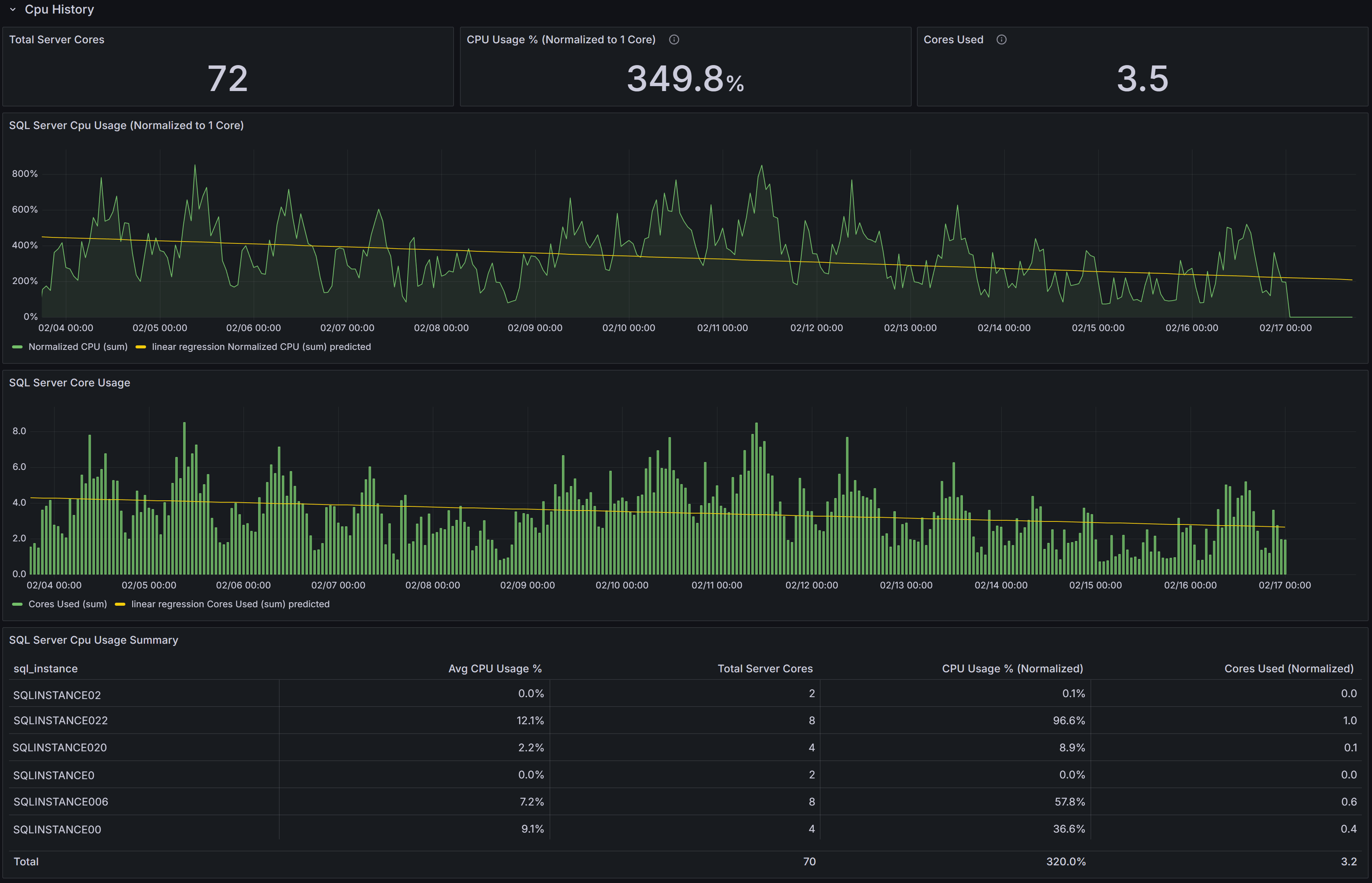 Capacity Planning dashboard showing CPU trends
CPU KPIs
At the top of the section, three key performance indicators summarize CPU metrics across the selected instances:
Total Server Cores displays the aggregate number of CPU cores available across all selected instances. This gives you a sense of your total CPU capacity and helps with capacity planning calculations.
CPU Usage % (Normalized to 1 Core) expresses average CPU utilization on a per-core basis, normalized to a single-core equivalent. This normalization allows you to compare CPU intensity across servers with different core counts on equal footing.
Understanding CPU Normalization
A 4-core server at 20% CPU utilization = 80% normalized (20% × 4 cores). This represents the workload intensity as if running on a single core, allowing fair comparison regardless of server size.Cores Used converts the normalized CPU percentage into an estimated count of cores actively in use across all selected instances. This is calculated as (Average CPU% × Total Server Cores ÷ 100). This metric provides an intuitive understanding of absolute CPU demand—if you see 3.1 cores used out of 24 total cores, you immediately understand both utilization intensity and available headroom.
CPU Usage Charts
Below the KPIs, two charts visualize CPU consumption patterns:
SQL Server CPU Usage (Normalized to 1 Core) shows each instance’s CPU utilization scaled to a single-core equivalent over time. This chart allows you to compare CPU intensity across instances with different core counts and identify which instances are experiencing the highest per-core pressure. Rising trends in this chart indicate increasing CPU usage that may eventually require optimization or additional capacity.
SQL Server Core Usage displays the estimated number of cores in use over time for each instance. This chart helps you understand aggregate core demand and evaluate capacity headroom. Sustained increases in this chart indicate growing workload that may eventually exhaust available capacity.
CPU Summary Table
The SQL Server CPU Usage Summary table ties the charts to individual instances and provides detailed per-instance metrics:
- SQL Instance identifies each server.
- Avg CPU Usage % shows the average CPU utilization over the selected time interval.
- Total Server Cores displays the number of CPU cores available on each host.
- CPU Usage % (Normalized) is calculated as Avg CPU% × Total Server Cores, showing the equivalent single-core utilization.
- Cores Used (Normalized) is calculated as (Avg CPU% × Total Server Cores) ÷ 100, showing the estimated number of cores actively utilized.
Use this table to rank instances by absolute CPU consumption and identify servers that would benefit from deeper investigation, query optimization, or workload redistribution. Sort by Cores Used to find instances with the highest absolute demand, or by CPU Usage % (Normalized) to find instances with the highest per-core intensity.
Interpreting CPU Trends
Look for rising trends in normalized CPU percentage or sustained high cores-used values. These patterns indicate growing CPU pressure that should be addressed before performance degrades. Sudden spikes may be acceptable if they correlate with known batch processes, but consistent baseline increases suggest permanent workload growth requiring capacity planning attention.
For instances with sustained high per-core utilization (above 70-80% normalized), these are candidates for:
- CPU capacity increases (more cores or larger VM SKUs)
- Workload redistribution to underutilized instances
- Deeper investigation using the Instance Overview dashboard to determine if optimization opportunities exist
Correlate CPU trends with memory, I/O, and wait-type metrics from other dashboards to form a complete capacity plan. CPU pressure combined with memory pressure may indicate that adding memory could reduce CPU load by improving cache hit ratios. CPU pressure combined with high CXPACKET waits may indicate parallelism tuning opportunities rather than capacity issues. Always allow headroom (commonly 20-30%) for growth and transient spikes unless autoscaling is available.
Data & Log Size
The Data & Log Size section tracks historical database file growth, helping you identify rapidly growing databases and plan storage capacity or maintenance before running out of disk space.
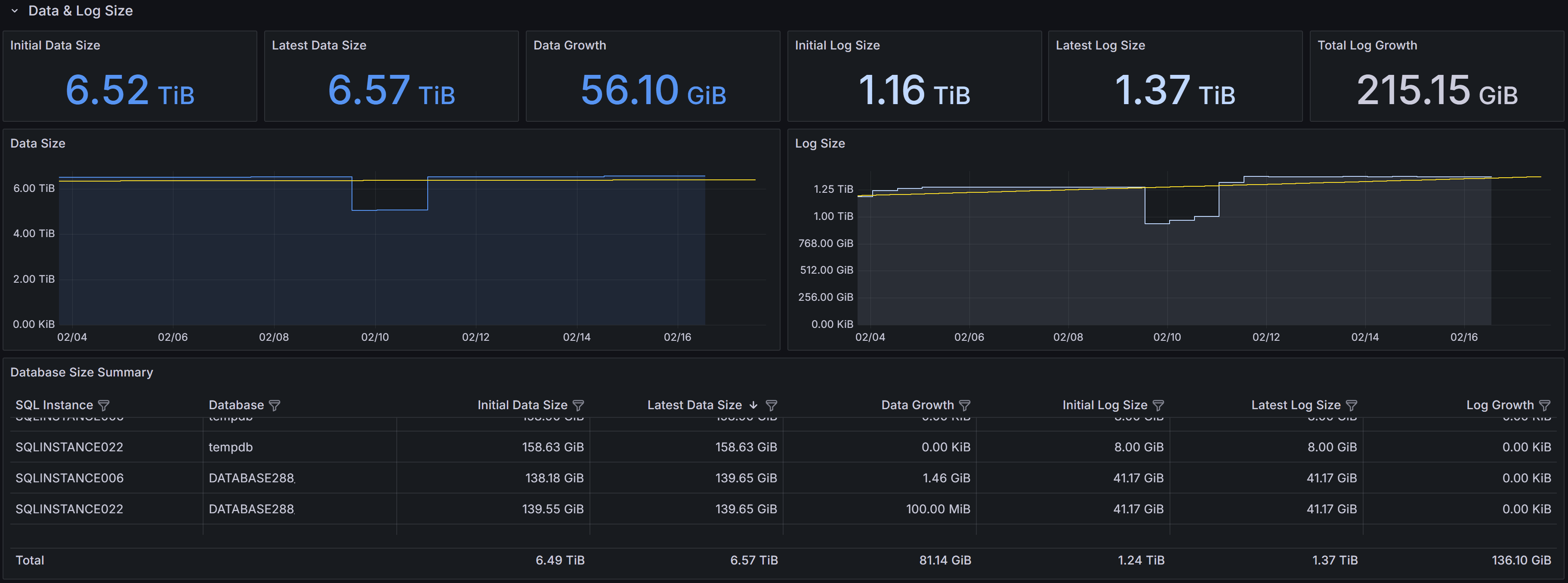 Capacity Planning dashboard showing disk space usage trends
Storage KPIs
Six KPIs summarize data and log file growth across the selected instances:
Initial Data Size shows the total database data file size at the start of the selected time interval, typically displayed in terabytes or gigabytes. This establishes the baseline for measuring growth.
Latest Data Size displays the most recent total data file size, showing the current storage consumption.
Data Growth shows the increase in data file size between the initial and latest measurements, indicating how much storage has been consumed during the interval.
Note
Negative growth can occur when databases are deleted, files are shrunk, or data is archived. Always investigate unexpected negative growth to ensure it was intentional.Initial Log Size shows the total transaction log file size at the start of the interval.
Latest Log Size displays the most recent total log file size.
Log Growth shows the change in log file size during the interval, which in well-maintained systems should be relatively stable or modest. Large log growth may indicate infrequent log backups, long-running transactions, or heavy bulk operations.
Storage Growth Charts
Two time-series charts visualize file size trends:
Data Size shows data file size changes over time for selected instances. Use this chart to detect steady linear growth indicating consistent workload increases, sudden jumps suggesting bulk data loads or new features, or unexpected decreases that may indicate data deletion or archiving activities.
Log Size shows transaction log file size trends over time. Log files in full recovery model grow until log backups truncate the inactive portion. Steadily growing log files often indicate infrequent log backups, while spikes may indicate large transactions or bulk operations. Consistently large logs may indicate long-running transactions preventing log truncation.
Database Size Summary Table
The Database Size Summary table provides per-database detail:
- SQL Instance and Database identify each database.
- Initial Data Size and Latest Data Size show data file sizes at the start and end of the interval.
- Data Growth shows the change in data file size.
- Initial Log Size and Latest Log Size show log file sizes at the start and end of the interval.
- Log Growth shows the change in log file size.
Use this table to rank databases by growth rate and identify candidates for archiving, compression, index maintenance, or retention policy changes. Sort by Data Growth to find the fastest-growing databases that may require additional storage allocation or investigation into why growth is occurring. Databases with large or growing log files deserve attention—investigate transaction patterns, backup frequency, and whether full recovery model is necessary for each database.
Interpreting Storage Trends
Rapid, sustained data growth may indicate new workloads, retention policy changes, missing cleanup jobs, or data hoarding without archiving strategies. Investigate recent application deployments, ETL process changes, or business requirement changes that might explain growth patterns. Compare growth rates with business metrics to determine whether growth is proportional to expected usage increases.
Large or growing log files often point to long-running transactions that prevent log truncation, infrequent log backups in full recovery mode, or heavy bulk operations. Review backup schedules to ensure log backups occur frequently enough (typically every 15-60 minutes for production databases). Investigate whether simple recovery model would be appropriate for databases that don’t require point-in-time recovery.
Use the time-range selector to analyze growth over different periods. Daily growth patterns help with immediate capacity planning, while weekly or monthly views reveal longer-term trends for strategic planning.
Disk Usage
The Disk Usage section shows historical disk I/O latency and throughput metrics, helping you identify storage performance bottlenecks and capacity issues that affect database performance.
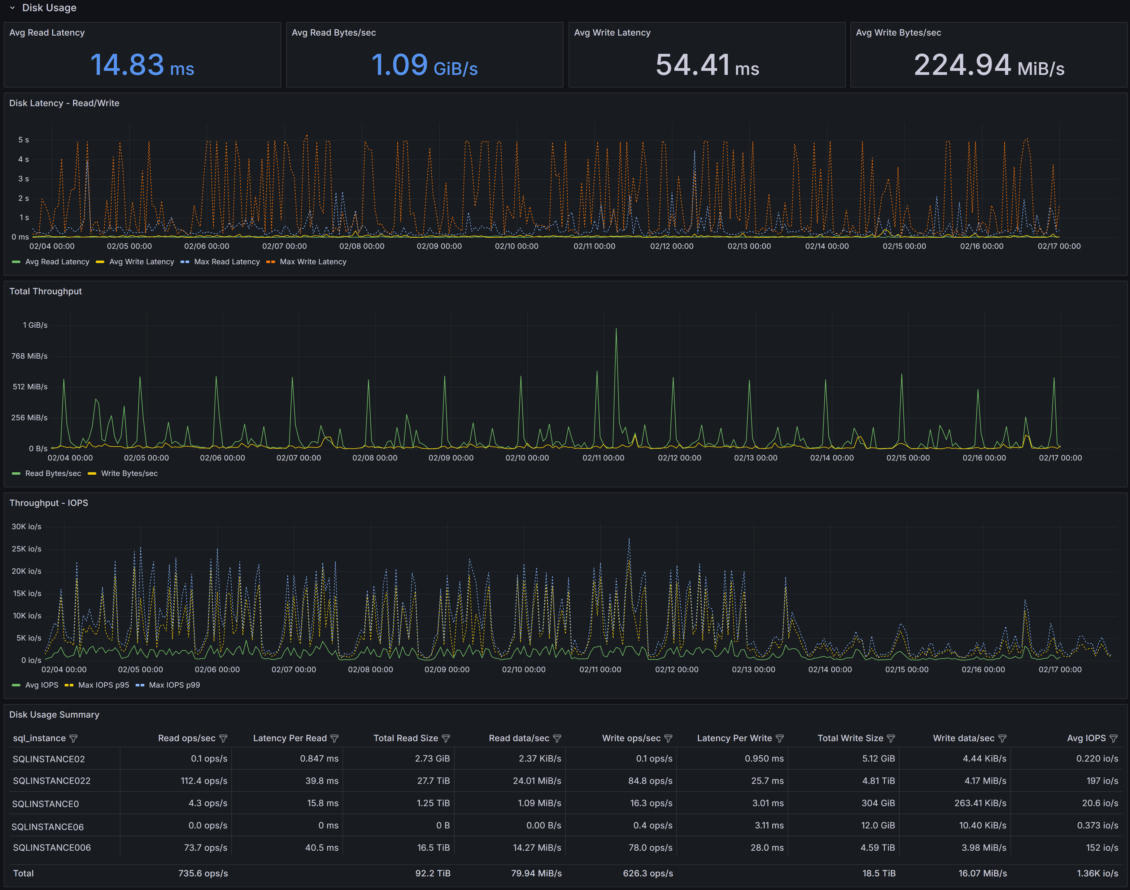 Capacity Planning dashboard showing disk usage trends
Disk Performance KPIs
Four KPIs summarize I/O performance across selected instances:
Avg Read Latency shows the average time in milliseconds for read operations to complete during the selected interval. For modern SSD storage, read latency should typically be under 5ms. Values above 10-15ms may indicate storage performance issues, excessive concurrent load, or storage configuration problems.
Avg Read Bytes/sec displays average read throughput, showing how much data is being read from storage per second. This metric helps you understand whether storage bandwidth is being consumed and whether you’re approaching storage subsystem limits.
Avg Write Latency shows the average time in milliseconds for write operations to complete.
Critical
Write latency for transaction log files directly impacts transaction commit times since log writes are synchronous. Values above 10-15ms may significantly impact application performance.Avg Write Bytes/sec displays average write throughput, indicating how much data is being written to storage per second.
I/O Performance Charts
Three time-series charts visualize I/O patterns over the selected time range:
Disk Latency - Reads/Write shows both average read latency and average write latency plotted together over time, along with maximum read and write latency values. The chart displays four series: Avg Read Latency, Avg Write Latency, Max Read Latency, and Max Write Latency. Use this chart to spot periods of elevated latency and correlate them with workload changes, concurrent activity, or storage system issues. Consistent high latency indicates chronic storage performance problems, while intermittent spikes may correlate with specific queries, batch jobs, or checkpoint activity. Pay particular attention to the gap between average and maximum latency—large gaps indicate inconsistent storage performance that may cause unpredictable application response times.
Total Throughput displays both read and write throughput (in bytes per second) on the same chart, allowing you to see the overall I/O bandwidth consumption pattern. Sustained high read throughput may indicate memory pressure forcing more physical reads, queries performing large scans, or increased workload. Regular spikes in write throughput for data files typically correspond to checkpoint intervals, while consistent write throughput reflects transaction activity levels. Compare read and write patterns to understand whether your workload is read-heavy, write-heavy, or balanced.
Throughput - IOPS shows I/O operations per second for reads and writes, along with maximum IOPS values. This chart displays Avg IOPS, Max IOPS (read), and Max IOPS (write).
IOPS vs Throughput
IOPS measures operation count, not data volume. High IOPS with low throughput = many small random operations (OLTP). High throughput with low IOPS = large sequential operations. Storage systems can be IOPS-limited or throughput-limited—understanding which bottleneck you hit guides upgrade decisions.Spikes in IOPS often correlate with index maintenance operations, checkpoint activity, or queries performing many small reads.
Disk Usage Summary Table
The Disk Usage Summary table provides detailed per-instance I/O metrics:
- SQL Server Instance identifies each server.
- Read ops/sec shows the average number of read operations per second, indicating read workload intensity.
- Latency Per Read displays average read latency in milliseconds for each instance.
- Total Read Size shows the cumulative amount of data read during the interval.
- Read data/sec displays read throughput rate.
- Write ops/sec shows the average number of write operations per second.
- Latency Per Write displays average write latency in milliseconds for each instance.
- Total Write Size shows the cumulative amount of data written during the interval.
- Write data/sec displays write throughput rate.
- Avg IOPS shows the average I/O operations per second (combined read and write) for each instance.
Use this table to rank instances by I/O pressure and prioritize investigation or remediation. Instances with high latency deserve immediate attention, especially if write latency is high on instances with transaction-heavy workloads. Sort by Latency Per Write to identify instances where transaction performance may be impacted by slow log writes. Sort by IOPS to find instances with the most I/O-intensive workloads that may be approaching storage system limits.
Interpreting I/O Metrics
Elevated read or write latency often points to storage contention, slow disk subsystems, high queue depth, or insufficient storage IOPS capacity. Correlate latency with throughput and IOPS metrics—high throughput with acceptable latency suggests the storage system is handling load well, while high latency with moderate throughput indicates the storage system is struggling.
High read throughput with low latency may indicate healthy buffer cache behavior and good storage performance. High read throughput with rising latency suggests memory pressure forcing excessive physical reads that the storage system cannot efficiently handle. In this case, adding memory may be more effective than upgrading storage.
For write-heavy workloads with high latency, review transaction patterns and log file placement. Ensure transaction log files are on fast storage separate from data files. Consider faster storage tiers (NVMe SSDs), enabling write caching with proper battery backup, or reviewing checkpoint interval settings to spread write load more evenly.
High IOPS with relatively low throughput typically indicates many small random I/O operations, which are more demanding on storage systems than sequential operations. This pattern is common in OLTP workloads and may benefit from faster storage (SSDs instead of HDDs) or better indexing to reduce the number of I/O operations required per query.
Large gaps between average and maximum latency or IOPS indicate inconsistent storage performance. This can cause unpredictable application response times even when average metrics look acceptable. Investigate whether storage system resource contention, competing workloads, or storage controller issues are causing the variability.
Use the time-range selector to isolate problematic time windows and correlate with Query Stats, CPU, and other dashboards before making hardware changes or storage tier upgrades. Sometimes what appears to be storage problems are actually caused by inefficient queries that can be optimized, eliminating the need for storage investments.
Memory Usage
The Memory Usage section shows memory allocation and demand patterns, helping you detect memory pressure and plan memory changes or workload placement decisions.
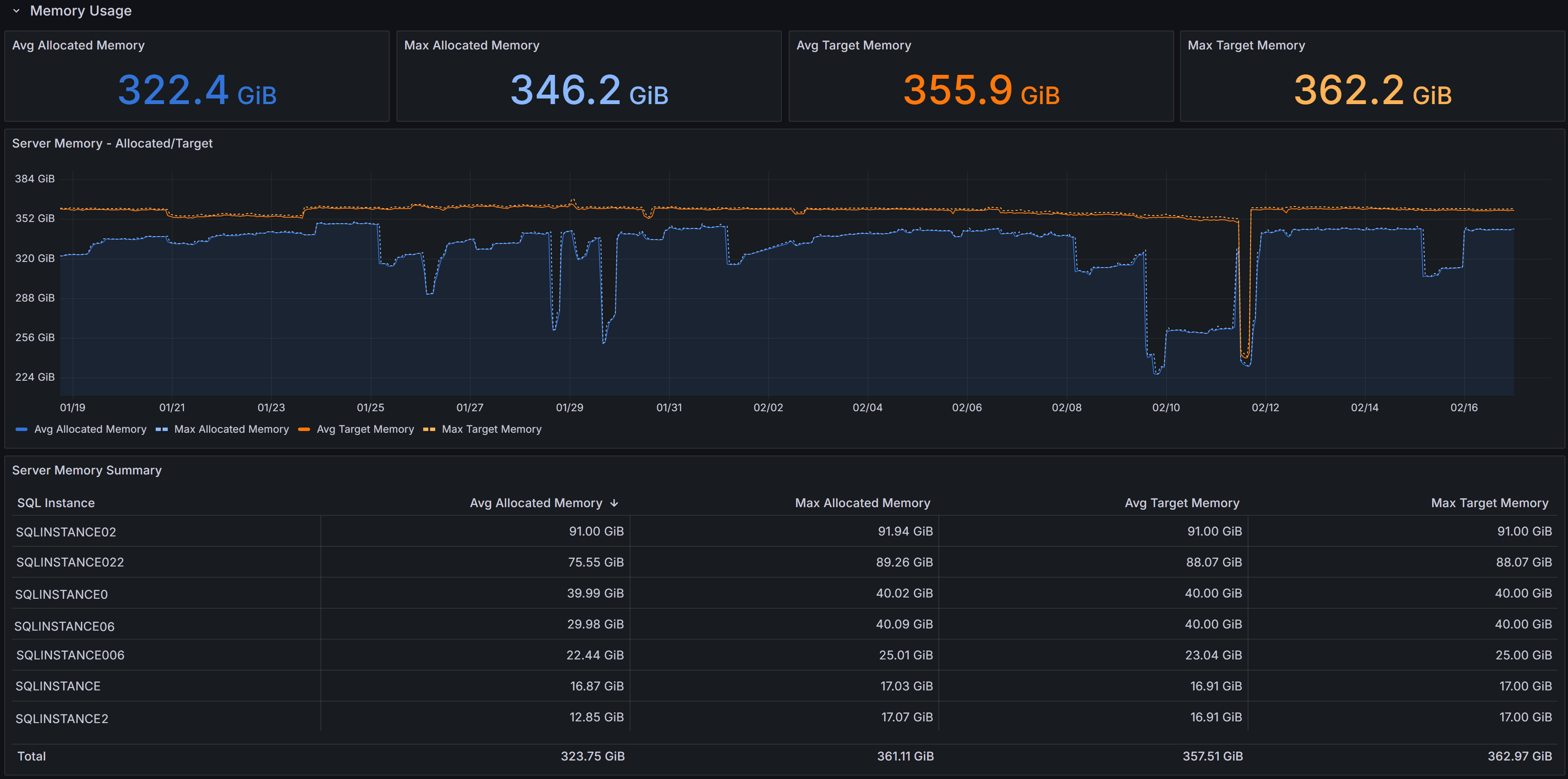 Capacity Planning dashboard showing memory trends
Memory KPIs
Four KPIs summarize memory metrics:
Server Memory - Allocated/Target displays both current allocated memory and target memory.
Max Allocated Memory shows the peak memory allocation observed during the selected interval
Avg Target Memory displays the average target memory SQL Server attempted to obtain based on workload demand and configuration. When target memory exceeds allocated memory consistently, SQL Server is experiencing memory pressure and would benefit from additional memory.
Max Target Memory shows the peak target memory during the interval
Memory Usage Charts
The Server Memory - Allocated/Target chart shows memory allocation and target over time for each instance. Use this chart to spot sustained allocation near target (indicating memory pressure) or gaps between allocated and target that may indicate memory configuration limits, OS constraints, or other factors preventing SQL Server from obtaining desired memory.
Server Memory Summary Table
The table provides per-instance memory metrics:
- SQL Instance identifies each server.
- Avg Allocated Memory shows average memory allocation during the interval.
- Max Allocated Memory displays peak allocation.
- Avg Target Memory shows average memory target.
- Max Target Memory displays peak target.
Use this table to rank instances by memory consumption and identify candidates for memory increases, VM resizing, or workload redistribution.
Interpreting Memory Metrics
When allocated memory consistently tracks close to target memory, SQL Server is successfully obtaining the memory it needs. Large gaps between target and allocated memory may indicate:
- Max server memory configuration set too low
- OS memory pressure limiting SQL Server allocation
- locked pages configuration issues
- Memory grants waiting or unable to be satisfied
Correlate memory trends with I/O metrics from the Disk Usage section. If memory pressure coincides with high read latency and read throughput, adding memory will likely reduce I/O load by improving buffer cache hit ratios, potentially providing better performance improvement than storage upgrades.
Review Page Life Expectancy and Memory Grants Pending in the Instance Overview dashboard alongside capacity planning memory data. When memory pressure is evident, this strongly indicates that additional memory will improve performance by reducing physical reads and improving query execution efficiency.
Using the Dashboard Effectively
Time Ranges: Use shorter ranges (days) for immediate issues, longer ranges (weeks/months) for trend analysis and capacity planning.
Correlation is Key: Combine capacity planning with Query Stats, Instance Overview, and I/O Analysis dashboards. High CPU with expensive queries suggests optimization before adding capacity. High I/O with memory pressure suggests adding memory before upgrading storage.
Plan with Headroom: Maintain 20-30% available capacity for growth and spikes unless autoscaling is available. Size for peak utilization, not just averages.
Regular Review: Revisit capacity metrics monthly or quarterly. Document baselines to track trends and adjust plans as workloads evolve.