Query Stats Detail
The Query Stats Detail dashboard focuses on a single query and shows how each compiled plan for that query performed over the selected time interval. This dashboard is your primary tool for understanding query performance variations, comparing execution plans, and diagnosing performance issues at the individual query level.
 Query Stats Detail dashboard showing query text, plan summaries, and performance metrics
Dashboard Sections
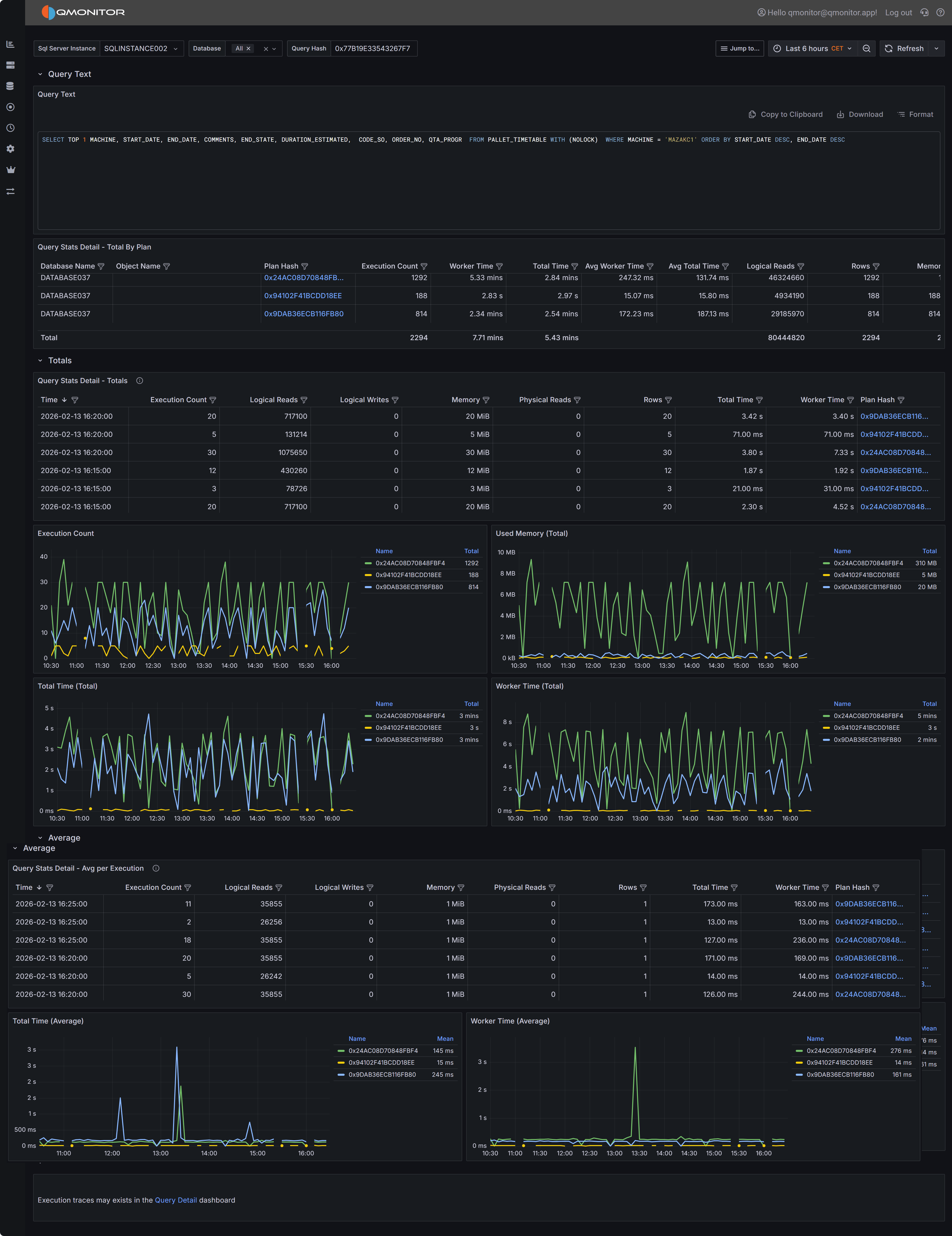
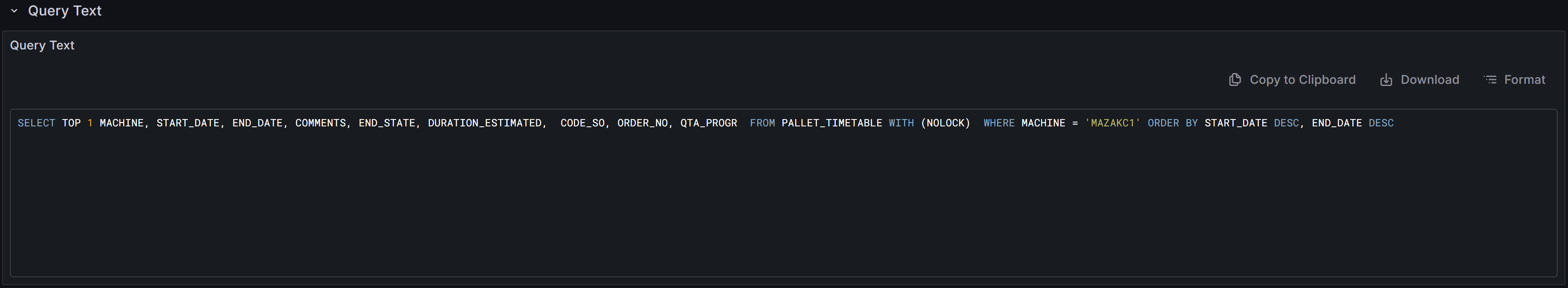
Query Text Display
At the top of the dashboard you will find the complete SQL text for the query you are investigating.
 Query text display with copy, download, and format controls
The toolbar above the query text provides several useful functions. The copy button allows you to quickly copy the entire query text to your clipboard so you can paste it into SQL Server Management Studio or another query editor for testing and optimization. The download button saves the query text as a SQL file to your local machine, which is useful when you need to share the query with colleagues or save it for documentation purposes. The format button reformats the query text with proper indentation and line breaks, making complex queries easier to read and understand. Properly formatted queries are particularly helpful when analyzing deeply nested subqueries or queries with many joins and predicates.
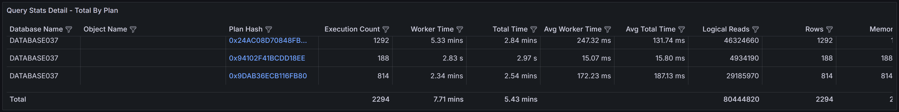
Plans Summary Table (Totals by Plan)
The Plans Summary table provides a high-level comparison of all execution plans that SQL Server has compiled for this query during the selected time range. Each row in the table represents a distinct execution plan, identified by its plan hash value.
 Plans summary showing execution counts and performance metrics for each plan
The table includes several key metrics to help you compare plan performance.
- Database Name indicates which database the query ran in
- Object Name shows the name of the stored procedure, function, or view that contains the query, if applicable.
- Execution Count shows how many times each plan was executed during the time range.
- Worker Time displays the total CPU time consumed by all executions of this plan.
- Total Time represents the total elapsed wall-clock time, which includes both execution time and any waiting time for resources.
- Average Worker Time and Average Total Time show the per-execution cost, helping you identify plans that are individually expensive versus plans that accumulate high cost through frequent execution.
- Rows indicates the number of rows returned by the query, which can help you identify whether different plans are returning different result sets or processing different amounts of data.
- Memory Grant shows the total memory allocated to executions of this plan.
This table is particularly valuable for identifying plan variations and understanding their performance impact. If you see multiple plans with significantly different performance characteristics for the same query text, this often indicates parameter sniffing issues where SQL Server cached different plans optimized for different parameter values. Plans with high average worker time or total time deserve investigation to understand what makes them expensive. Plans with very high execution counts but low average cost might benefit from application-level caching or query result reuse rather than query-level optimization.
Totals Section
The Totals section displays time-series data showing how query performance varied over the selected time range. The data is aggregated into 5-minute buckets, with each row representing the cumulative metrics for all query executions that occurred during that 5-minute period.
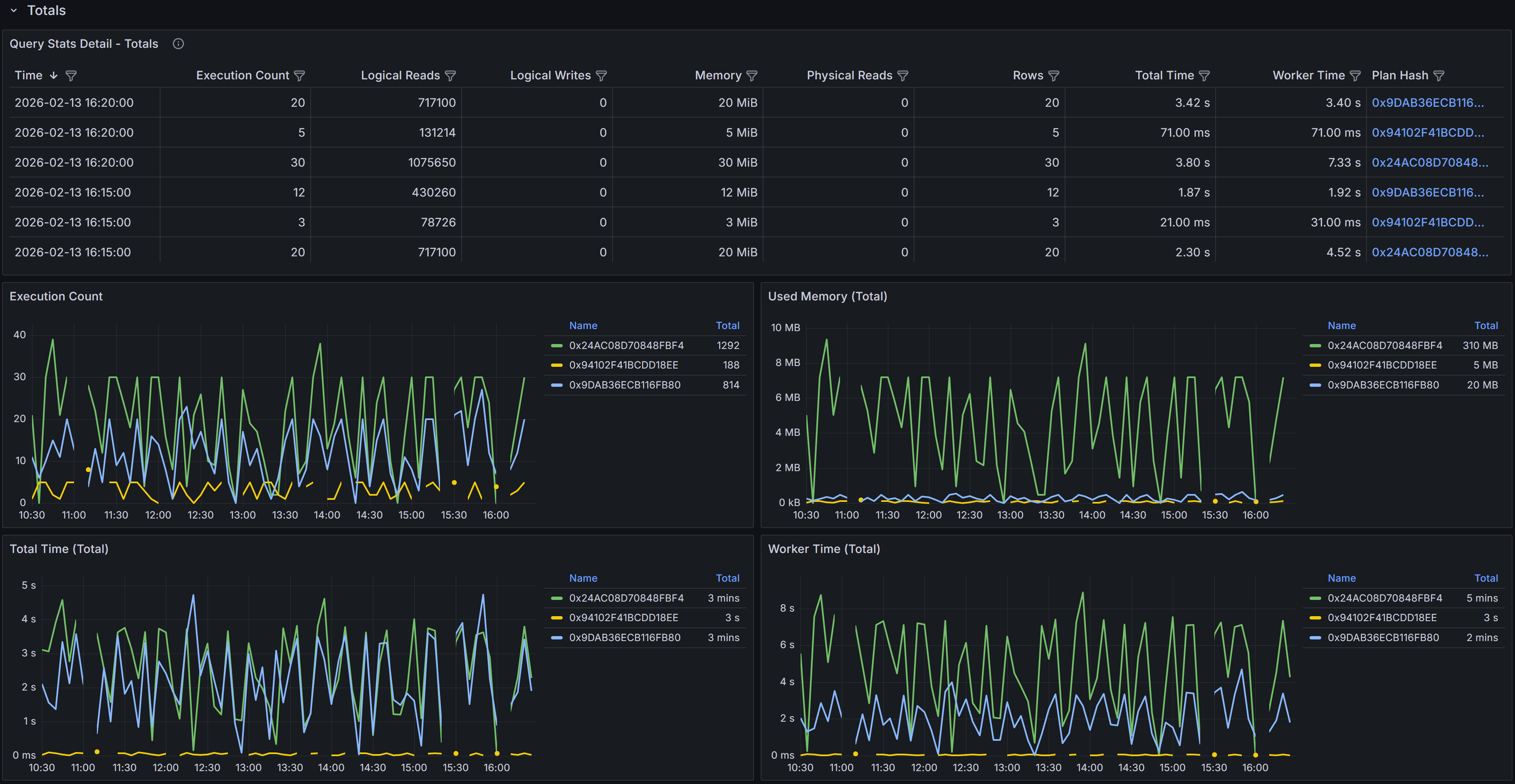 Time-series table and charts showing cumulative query performance metrics
The time-series table includes detailed metrics for each 5-minute bucket.
- Time shows when the 5-minute bucket started.
- Execution Count indicates how many times the query ran during that period.
- Logical Reads displays the total number of 8KB pages read from memory during all executions in the bucket.
- Logical Writes shows the total pages written.
- Memory represents the cumulative memory grants for all executions.
- Physical Reads indicates how many pages had to be read from disk because they were not in the buffer cache.
- Rows shows the total number of rows returned by all executions.
- Total Time represents the cumulative elapsed time for all executions
- Worker Time shows the cumulative CPU time.
- Plan Hash identifies which plan was used during each sample period.
The Plan Hash values in the table are clickable links. When you click a plan hash, QMonitor downloads the execution plan as a .sqlplan file that you can open in SQL Server Management Studio.
The charts in the Totals section visualize how query performance varied over time and how different plans contributed to resource consumption. The Execution Count by Plan chart shows how frequently each plan was executed during each time bucket, helping you understand plan usage patterns. The Memory by Plan chart displays memory grant trends, which is valuable for identifying queries that request excessive memory or queries whose memory requirements vary significantly over time. The Total Time by Plan and Worker Time by Plan charts show how much elapsed time and CPU time each plan consumed, making it easy to spot periods when query performance degraded or when a particular plan dominated resource usage.
Tip
Use these charts to identify performance patterns and correlate them with other events. If you see a sudden spike in worker time or total time at a specific point in time, you can investigate what changed at that moment. Did SQL Server switch to a different execution plan? Did the query start receiving different parameter values? Did concurrent workload increase and cause resource contention? The time-series view provides the temporal context needed to answer these questions.Averages Section
The Averages section presents the same time-series data as the Totals section, but with metrics averaged per execution rather than aggregated cumulatively. This view is particularly valuable for understanding the per-execution cost of the query and identifying when individual executions became more expensive.
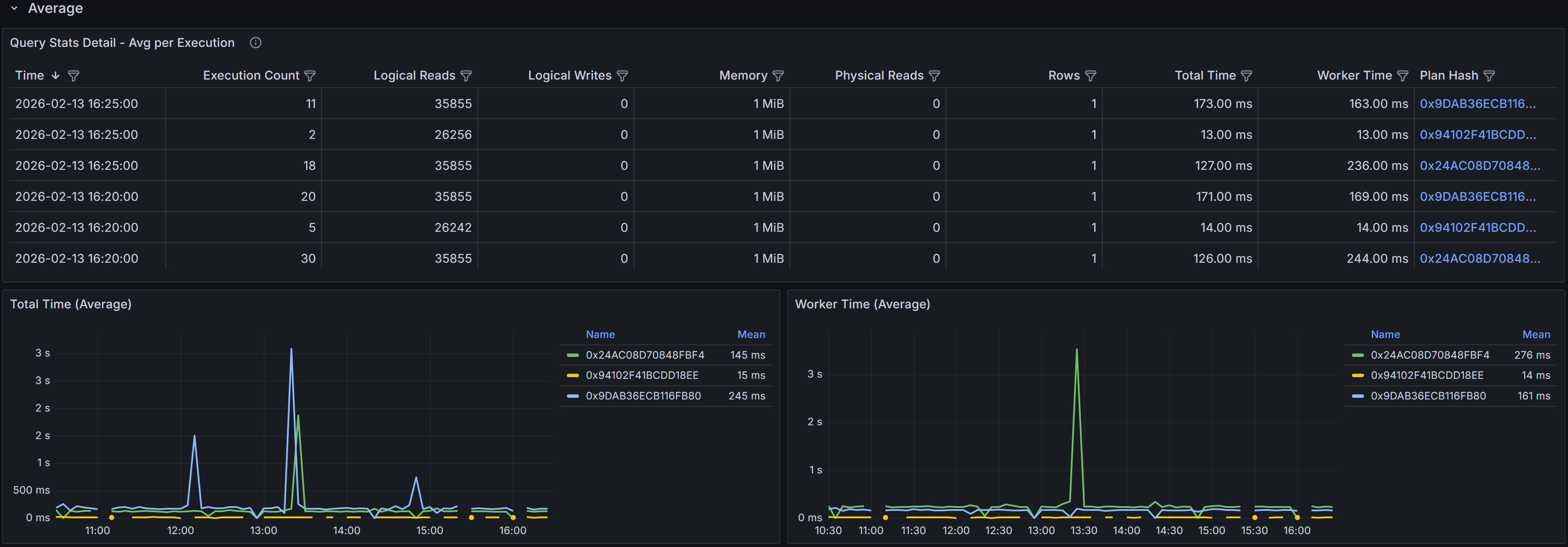 Time-series table and charts showing average per-execution metrics
The time-series table in the Averages section shows metrics averaged across all executions that occurred during each 5-minute bucket. For example, if the query executed 100 times during a 5-minute period with a total worker time of 50,000 milliseconds, the average worker time would be 500 milliseconds per execution. This per-execution perspective helps you identify whether query performance degradation is due to the query becoming inherently more expensive or simply running more frequently.
The columns mirror those in the Totals table: Sample Time, Execution Count, averaged Logical Reads, Logical Writes, Memory, Physical Reads, Rows, Total Time, Worker Time, and Plan Hash. The Execution Count is not averaged since it represents the number of times the query ran, but all other metrics show the average value per execution during that time bucket.
The charts in the Averages section focus on per-execution cost trends. The Total Time (avg) by Plan chart shows how the average elapsed time per execution varied over time for each plan. The Worker Time (avg) by Plan chart displays the average CPU time per execution. These charts help you distinguish between performance issues caused by increased query frequency versus issues caused by increased per-execution cost.
Example
For example, if the Totals section shows high cumulative worker time but the Averages section shows low average worker time per execution, the high total cost is due to query frequency rather than query efficiency. In this case, application-level solutions like caching, query result reuse, or reducing unnecessary query executions might be more effective than query optimization.
Conversely, if the Averages section shows high per-execution cost, the query itself is expensive and needs optimization through better indexes, query rewrites, or plan improvements.
Investigating Query Performance
When analyzing query performance using this dashboard, start by examining the Plans Summary table to understand how many distinct plans exist for the query and whether any plans are significantly more expensive than others. Multiple plans with different performance characteristics often indicate parameter sniffing issues where SQL Server cached plans optimized for specific parameter values that may not be optimal for all parameter combinations.
Use the Totals and Averages charts together to understand performance patterns. High totals with low averages suggest the query runs frequently but each execution is relatively cheap, pointing to application-level optimization opportunities. High averages indicate expensive individual executions that need query-level optimization. Comparing performance across different time periods helps you identify whether performance degradation was gradual or sudden, which provides clues about the root cause.
Using the Dashboard Effectively
Set the time range selector to focus on the period when performance issues occurred. If you are investigating a regression that started yesterday, select a time range that includes both before and after the regression so you can compare plan behavior and metrics. For ongoing performance issues, use a recent time range like the last few hours to analyze current behavior.
Sort and filter the time-series tables to focus on specific time periods or plans. If you know that performance degraded at a specific time, filter the table to show only samples from that period. If you want to compare two different plans, filter by plan hash to isolate their metrics.
Download multiple execution plans when comparing plan variations. Open them side by side in SQL Server Management Studio to identify exactly what changed between plans. Look for differences in join types, index selection, join order, and operator choices. Understanding why SQL Server chose different plans helps you decide whether to update statistics, add indexes, use query hints, or enable plan forcing.
When you identify a specific plan that performs best, consider using Query Store plan forcing to lock the query to that plan. This prevents SQL Server from choosing suboptimal plans in the future, providing stable and predictable performance. However, plan forcing should be used carefully and monitored regularly, as data volume changes or schema changes may eventually make the forced plan suboptimal.
Compare Totals and Averages to determine whether optimization efforts should focus on reducing per-execution cost or reducing execution frequency. If totals are high but averages are low, work with application teams to reduce unnecessary query executions, implement caching, or batch operations. If averages are high, focus on database-level optimization like indexes, query rewrites, or schema changes.